 It is no secret that the color in your designs is important, but did you know how important? There are a lot of theories on color perception and it’s effects on how people feel. While there is no evidence that shows a correlation between colors and a particular feeling, there is quantitative research showing the color’s effects on branding and marketing.
The color red might not mean passion and excitement to everyone because perception of color is largely affected by personal experiences. However, the choice to have red in your design will make an important impression on every consumer that sees it. According to the Institute for Color Research, within 90 seconds of viewing a product, people make a subconscious judgment, and majority of that evaluation is based on just color.
It is especially important to make good color choices when constructing design, especially for a large scale design graphic-like vehicle wraps or window graphics. Imagine what a nightmare it would be to wrap your fleet of vehicles in a design that is garnering bad snap judgements. Developing graphics is an extremely important, highly strategic, nerve-racking endeavor.
Here are some tips to developing effective large format graphics.
-
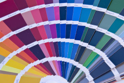
Color Coordinate.
Every color on your graphic matters. It is important to strategically use contrasting colors. Contrast can draw consumer’s attention. Too much contrast can cause a graphic to look busy and unprofessional.
-
Know your audience.
While color perception is based on personal preference and background, there are studies that show larger patterns depending on demographic. Research shows there are color combinations that appeal more to women than men, and visa versa. The same is true for age groups. Knowing your targeted demographic can help you tailor your design. Additionally, the cultural background of your potential consumers needs to be taken into consideration. The colors that appeal to American women may not appeal to European women.
-
Be unique.
Research has suggested that it is important to stand out from competitors, and to accomplish this, you should make your designs purposefully different.
-
Show your personality.
There have been numerous studies regarding brand personality and color appropriateness. The conclusion is that consumers prefer colors that they perceive to be appropriate given the brand’s personality, so they don’t necessarily care about what color you’re using as long as it is appropriate for the image your brand conveys. There needs to be an understandable context for your choice.
Designing a graphic can be a little overwhelming, especially large format designs. The good news is Brand’s Imaging can help. A full service custom design and printing firm, we have the tools to make effective unique large-scale graphics. Whether you want a custom wall mural or you need to beautify a construction site, Brand’s Imaging has the experience and creativity to help you generate and implement a design.